Using Google Gemini to Learn Candlestick
Charts and Moving Averages
This post aims to expose you to generative AI so that you
can become a better security trading analyst.
I have been using a Google implementation of generative AI (Gemini and its
predecessor, Bard) for about a year. In
that time, I discovered many use cases. The
examples in this post are meant to introduce beginner security trading analysts
to candlestick charts and moving averages.
No matter what your level of experience as a security trading analyst,
it is hoped that the examples in the post give you the experience and
confidence to discover the generative AI use cases that are most beneficial for
you.
The Google Gemini FAQ
provides succinct remarks about what Google Gemini is and how to use it. If the current version of its FAQ is
maintained, you may also be able to track information about new releases,
underlying technologies, and what features are available in your language and
country. I particularly appreciated the
answer for “Why can Gemini get things wrong?”
You should never assume that generative AI is infallible. Instead, prompt Google Gemini in different
ways and perform internet searches to confirm your understanding of what Google
Gemini is conveying.
This post focuses on demonstrating the chatbot capabilities
offered by Google Gemini for a couple of substantive areas.
- You will learn how to get started using Google Gemini and some basic features that it offers. The term Gemini is often used when referring to analytical and programming finance applications. Therefore, you are encouraged to call Google Gemini by both parts of its name, so you do not inadvertently recover search items or chatbot responses on some other applications that are not Google Gemini. That said, the remainer of this post refers to Google Gemini as Gemini for the sake of brevity.
- Next, a series of chats will be shown to demonstrate how to start learning about candlestick charts. A candlestick chart is very widely used for visualizing security price changes over periods, such as days. A candlestick chart is especially helpful for uncovering price reversals.
- Another series of chats will drill down on moving averages. This kind of security analysis tool targets making intermediate-term security price change estimates based on price trends.
Getting Started with Gemini
At the time that I am writing this post, Gemini knows my
workstation as a user representing me. The
following screenshot shows Gemini’s response to this request: how to get started
with google gemini for the first time. Gemini
is a generative AI tool that accepts text and other forms of content specifying
a prompt. Gemini returns a response to
the prompt. I firmly believe that you
will become a much better security trading analyst faster after you gain a working
knowledge of Gemini and start chatting with it for topics about which you want
to learn more.
Gemini’s response includes a couple of urls (https://support.google.com/gemini/answer/14554984?hl=en&co=GENIE.Platform%3DAndroid
and https://ai.google.dev/) that Google
offers for learning more about Gemini.
See the full answer Gemini gives for the prompt appears in the following
screenshot. The response:
- starts with a re-statement of the prompt,
- contains a body with text for a response to the prompt, and
- terminates with internet links for supplementary information to the prompt.
After the above content, Gemini offers several icons for providing
feedback on the response and otherwise using the response. After these icons, another chatbox appears for
you to issue another prompt.

Google is regularly including new capabilities in Gemini and
updating existing functionality. When I
first started with Gemini, I found this following link (https://gemini.google.com/app)
helpful for connecting to and enabling me to start issuing requests or prompts
for information about a topic. If you
are starting from a computer that has never connected to Gemini, then you will
see a response like the one pictured next.
By clicking your way through one or more introductory screens with Next
links, you will see a chatbox that invites you to enter a prompt. Then, Gemini will return a response to the
prompt. If the response does not provide
the help you are seeking, then issue a new prompt that gives Gemini more help
about the information that you are seeking.
Repeat issuing new prompts for as many times as necessary to get the
help you seek. If you wish, you can use
the icons after each response to provide feedback to Google about the response
to an individual prompt or your experience getting the help you seek.

Learning about Candlestick Charts with Gemini
Candlestick charts are widely available in many internet
charting packages (e.g., stockcharts.com and finviz.com). This chart type offers a quick way of viewing
the price movements of a security over successive trading periods (e.g., days
or weeks). Because so much security price
activity is commonly displayed in so many places with candlestick charts, it is
good to have a working knowledge of candlestick charts. Gemini offers one means of achieving that knowledge.
The following screen indicates what a prompt and a response
can look like for showing a candlestick in a financial chart from Gemini. The response displays a financial chart with
a collection of candlesticks. There is
text both before and after the financial chart.
- The text before the sample chart introduces terms like candlestick body, opening and closing prices for a period, high and low prices for period, and wicks that can extend from the top and bottom of a candlestick.
- The text after the sample chart narrows the focus to the significance of a candlestick’s body color as well as the length of a the top and bottom wicks for an individual candlestick.

The “Show drafts” text on the top right above the response in the preceding screenshot allows a user to select from three alternative draft responses to the prompt. Clicking the arrowhead next to the text exposes rounded boxes with excerpts from each of the three draft responses. The image below depicts the third draft response to the prompt in the preceding screenshot. The response content below highlights the same points in the preceding response plus an additional trailing paragraph that points to the value of candlestick charts for making informed decisions about buying and selling securities.

Technical analysis for security prices depends on multiple candlestick
patterns for gauging times when prices are likely to rise, fall, or stay the
same after the pattern. You can use
Gemini to learn more about these patterns, but you should not accept Gemini
responses as infallibly true. Google
recognizes the possibility of error in Gemini responses, and it offers a Double-check
response icon in the set of icons at the end of responses. Clicking the Double-check response icon can display
links to alternative sources from the internet that you can use to assist in
verifying the veracity of a Gemini response.
The following screenshot begins with a prompt to and the first
response section from Gemini that identifies several candlestick pattern types. The prompt is an instruction to name typical
candlestick patterns. The following response
section indicates that it will be followed by examples of candlestick patterns that
typically precede times when prices trend up, down, or remain the same.

The first of the following three response sections includes images and
descriptions for a selection of candlestick patterns that Gemini calls bearish reversal
patterns. This means that the patterns in this group should precede times when prices
are likely to reverse from an uptrend to a downtrend.
- Unfortunately, the first named candlestick pattern (inverted hammer) fails to meet the criterion for membership in the group. Following an inverted hammer pattern security prices are expected to rise instead of fall. It is possible that Gemini confused references to an inverted hammer pattern with a shooting star pattern. These patterns are sometimes discussed together, but the shooting star pattern points to a time with future declining prices while the inverted hammer pattern points to a time of future rising prices. The Double-check response icon was able to uncover internet resources to verify that an inverted hammer pattern is not an example of a bearish reversal pattern.
- In contrast to the inverted hammer pattern, the bearish engulfing pattern and the three black crows pattern both point to times when prices are to reverse an uptrend in prices to a downtrend in prices.

The second response section appears next.
This section is to name, describe, and illustrate bullish reversal
patterns. A bullish reversal points to a
time when prices switch from a downtrend to an uptrend. This response section references three
candlestick patterns that do indeed point to candlestick patterns after which prices
cease to fall and begin to rise.
- A hammer pattern has the appearance of a hammer with a long bottom wick and a short body. This pattern appears at the end of a downtrend in prices. It is not essential that the hammer body be green, but that outcome supports the reversal action following pattern.
- A bullish engulfing pattern consists of two candlesticks. The pattern refers to a case where a red candlestick is followed by a green candlestick. The high price for the green candlestick should be greater than the high price for the red candlestick, and the low price for the green candlestick should be less than the low price for the red candlestick.
- The three white soldier pattern consists of three successive white (or green) candlesticks. The candlesticks are long and successive candles that overlap one another. For this pattern to appear, the bulls must be in control of the pricing action during the pattern. Because the bulls are in control during the pattern, candlestick analysts believe that this pattern will persist in at least the short term and perhaps even the long term.

The following response section refers to the doji pattern and the spinning
top pattern as continuation patterns. However,
I was able to elicit another response from Gemini with a different prompt. The
response to the different prompt asserted that neither the doji pattern nor the
spinning top pattern is an example of a continuation pattern. The prompt for this alternative response was:
are the doji and spinning top examples of a continuation pattern?
On the other hand, the rectangle pattern is widely regarded as a continuation pattern. Other common continuation patterns not mentioned in the following response section include triangles, flags, and pennants. I was able to uncover these unmentioned continuation pattern names through an internet search.

Learning about Moving Averages with Gemini
Moving averages are another analytical method, beside candlestick
charts, for tracking changes in security prices over time. Moving averages reflect the average price of
a security over a succession of periods.
The averages can be for trading days, trading day parts, such as five-minute
intervals, or trading day groups, such as weeks or months. The moving averages help to dampen period-to-period
volatility which can obscure the general direction of daily prices over
time. The longer the period duration,
such as a trading week versus a trading day, the greater the degree of smoothing.
The following prompt and response from within Gemini includes
an example to help clarify the advantages of moving averages for closing
prices. Notice how tracking a ten-day
moving average can help discern price trends that daily closing prices for each
individual trading day do not reveal.

There are two types of moving averages that are typically used in financial
analyses. The following prompt and Gemini
response gives names and provides an overview for each type of moving average.
- The simple moving average is the easiest to understand of the two moving average types. One reason that the simple moving average is so easy to understand is because it depends on arithmetic moving averages, which most traders and analysts already know how to compute.
- In contrast, the exponential moving average places a heavier weight on the most recent closing price relative to the simple moving average. This is particularly advantageous when you want to track recent prices more closely than less recent prices, which is desirable for constructing automated trading models.

The next prompt-response pair compares simple moving averages versus
exponential moving averages on multiple criteria. The weights for individual periods with simple
moving average are identical for each period.
In contrast, an exponential moving average places a larger weight on
prices from the most recent periods.
This simple distinction has implications for a variety of comparison
criteria.
- The exponential moving average is faster to reflect changes from more recent periods than the arithmetic moving average.
- The reason that the simple moving average is slower to reflect changes is because it places an equal weight on all periods in a moving average, but the exponential moving average places a greater weight on the most recent price. Additionally, the weight for subsequent trading days are exponentially multiplied for each successive trading day.
- When you need information about the change in the most recent periods, then the exponential moving average is clearly better.
- Some analysts believe that simple moving averages are superior for assessing long-term price movements.
- In any event, there are many analysts who make recommendations based on simple moving averages. Therefore, if you prefer to have your results agree with these analysts, then you should consider using simple moving averages in your asset price performance analyses.

A single series of asset prices can have multiple sets of simple or
exponential moving averages. This is because
moving averages have a period length attribute.
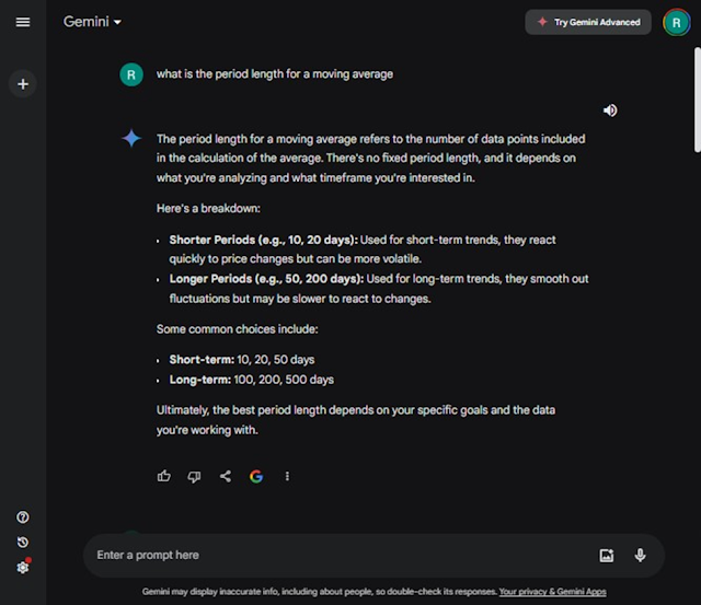
The following prompt-response pair from Gemini gives you an introduction
to period lengths for moving averages. There
is no standard about which length is right for all trading security analyses.
- The response below states that you can use 10-day or 20-day period lengths for short-term analyses. For securities that trade on major markets, 10 trading days is about a two-week span of time and 20 trading days is about a one-month span of time.
- A very common pair of period lengths used by stock market technical analysts and traders are the 50-day and 200-day moving averages. When the 50-day moving average crosses from below to above the 200-day moving average, this points to the likelihood that closing prices will reverse from declining values to increasing values. This kind of cross is called a “golden cross” in technical analysis.
An upcoming post will review step-by-step instructions for computing simple and exponential moving averages for this blog. If you want an example comparing simple and exponential moving averages before then, see Differences Between Exponential Moving Average and Simple Moving Average in SQL Server.
Concluding Comments
This post aims to introduce via Gemini the basics of
candlestick and moving average analytical techniques for financial trading data. I hope this post inspires you to learn more
about the techniques addressed in this post.
Future posts on this blog will show more detailed steps and examples for
the techniques introduced in this post.
Also, it is likely that generative AI techniques will be included in
future posts because of its potential value for security trading analyts.
Please consider sending a message to RickDobsonBlogs@gmail.com
with any questions or comments you want to share about the analyses presented
in this post, security trading analytics generally, or Gemini.


Comments
Post a Comment